“Every good picture is fundamentally an arrangement of three or four large masses-“
So begins Chapter 1 in my aged copy of “Elementary Principles of Landscape Painting”, by John F. Carlson (now revised and available as Carlson’s Guide to Landscape Painting).
Like many others, I really admire John Carlson’s landscape paintings. I first encountered them face-to-face at the Grand Central Art Gallery in NYC. And this was about the time I’d heard about his book, “Carlson’s Guide to Landscape Painting”. But I have to say that when you see his work on a wall… it’s deep and it’s impressive. You know it’s the work of a painter who valued his craft and was genuinely responding to nature in a powerful way. And that leads to paying much closer attention to what he had to say back in 1928, when his book was first published. I can only hope that everyone who has read it might also, someday, have the chance to see his work personally.
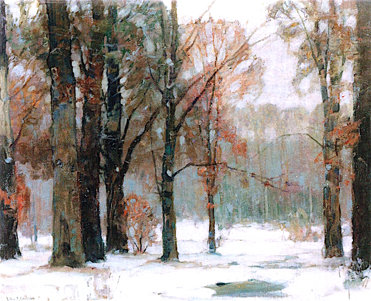
Carlson’s Theory of Angles and Consequent Values
One of the great practical lessons from the book is Carlson’s summation of how light affects the elements of the landscape.
He refers to it as the “Theory of Angles and Consequent Values”. Carlson recognized that any landscape typically possesses four groups of values (degrees of light and dark) affecting three major planes… the horizontal ground plane, the angle plane represented by mountain slopes, rooftops, etc., and finally an upright plane, perpendicular to the ground plane, which can include anything from trees and walls to a standing human.
In order to interpret the landscape in a painting successfully, an artist needs to simplify and organize nature. Values are that which make form visible. Translating nature into value patterns,(i.e. grouping of lights and darks into shapes), are one of the ways of doing so. Applying Carlson’s theory makes that much easier.
“The first two things to study are form and values. For me, these are the bases of what is serious art.” -Camille Corot
When daylight is overhead, as it would be at noon for example, the sky is the source of light and therefore occupies the highest values on the gray scale. The ground plane receives the largest amount of light, and accordingly is the next lightest value plane. The slanted/angular planes receive less exposure to direct light than the ground plane and so rest within a middle-value range. This leaves everything in the upright plane to become the darkest value element.
While this is a wonderful help in creating order, it’s also a little abstract when read on the printed page alone.
A Model
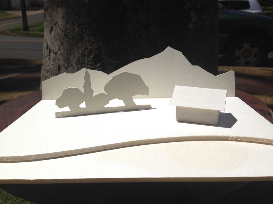
Because of this, I decided it would be easier to understand if I had a physical model, and over time I’ve built several. Most recently a student and I assembled one out of white foam core, which makes Carlson’s theory much more tangible. I thought it would be fun to share with others who may want to repeat the exercise themselves.
We added a small structure at an angle for additional interest, which isn’t from Carlson’s original description.
When finished and assembled ( using a steel ruler, an X-acto knife, acid-free Foamcore, and Lineco PVA glue), we put the model outdoors in daylight with the sun directly overhead. The results are shown below.



13 Comments
Thanks mark. I will point students at your blog post later this month as I have a landscape class that will surely review Carlson in no small part.
Great demo Mark. I’ve read the book but the demo really hits home. Any theory why your mountains are lighter than your trees? I’m sure reflection from the horizontal plane is part of it but that reflection should be on the trees too.
Thanks Paul, and I’m pleased that you found this helpful. To answer your question, the mountain plane, being at a slant to the overhead light source, should be receiving more light ( and be lighter in value) than the upright plane of the trees and walls, and somewhat light than the ground plane.
Hi Leo, and thank you. I think Stapleton Kearns blog posts on Carlson are terrific as well, they’re inspiring me to do a re-read of the book. Cheers from Hawaii.
Of course! I should have realized the mountains are on a slant. Didn’t see it at first. Thanks.
Paul,I should have included a diagram from the side, which is what Carlson did in his book. Nobody can easily tell from the photo that the mountain plane is slanted.
Great demo! I learned this from Scott Christensen while in his workshop. He is a big fan of John Carlson and he probably learned it from the book.
Hi Steve, and thanks for commenting. It’s great that Scott Christensen is teaching this. If you haven’t already, I hope you find a chance to read the book yourself.
I’m hoping for a re-read myself, I’m sure I’ve forgotten plenty of good points since last time.
I love the lighter value on roof due to less slant than mountains. Have been reading all I can about this approach. Your model is a great proof . Have you done any paintings applying these rules?
Would love to see them
.hoping to start one in the next few days.
Hi Jill, thanks for your comment. The model does concretize the ideas Carlson lays forth, and building one ( which is really not too difficult!) firms it up in one’s mind. I apply the principles when I paint almost anything…but probably the most helpful one (for me) is that the ground plane receives the most light. I’ve strengthened many a painting by observing that truth.
Thank you! Seeing it this way really drives home the point!
Was just re-reading Carlson’s book and appreciate how your words and model help to further his lessons.
That concept is the MOST important concept for all painting.
Most of my students find that reading Carlsons’ book is difficult.
After teaching for over 50 years, I attempted to illustrate his concept more clearly in one of my books.
“Principles and Techniques of Drawing and Painting”
Available on Amazon and on my website-robertjkrajecki.com.