Pinterest Piques My Interest

In the last few months, I’ve really discovered the value of Pinterest as a very helpful teaching tool. Considering my mild-to-moderate  aversion to technology as the answer to everything, this is a concession that I happily make.

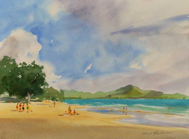
Students in my Plein Air, Life Drawing and Portraiture classes are constantly encouraged to look at really good examples of the work of accomplished artists.  The difficulty is that they often don’t find the time, recall the names,  or know the best ways to investigate the artist’s I’ve suggested.  So up to this point, it’s  been up to me to bring in examples from books from my personal library or reference files I’ve accumulated. Lot’s of lugging around  (and plenty of wear and tear) on out-of-print art books and catalogs that are pretty precious to me.

Then along comes Pinterest.

Using it as a resource, I’ve created boards for each group I teach. Students are reminded, often, to check the Pinterest boards I have up on my page, especially when I’m involved in a one-to-one critique and see a problem that would benefit from an illustration.

Screen Shot 2014-06-02 at 11.37.56 AM

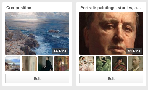
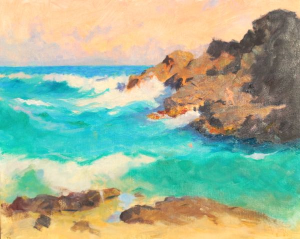
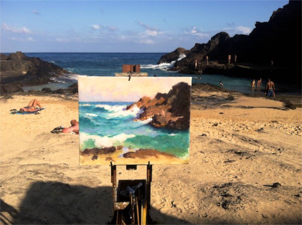
For example, ” Composition” is  helpful for every student, but especially the Plein Air and Portrait folks.  They are usually fully occupied with making things look like what they’re seeing, and of course need to consider the design of the elements as an important factor.  With the examples I’ve collected on Pinterest they can see some really interesting uses of pattern and placement that might spark their interest and encourage spending more time on design.

Screen Shot 2014-06-02 at 11.38.21 AM

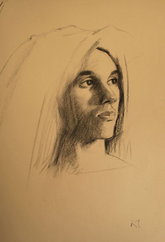
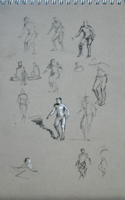
For Life Drawing, there are many beautiful and compelling images of fine drawings available. Beautiful touches, line variety, pieces that reveal construction (The Carravaggio is full of lessons) all to show the tremendous possibilities. Ingres’ drawing of his house cat reminds that there are worthy  subjects everywhere, even to the most sophisticated talent.

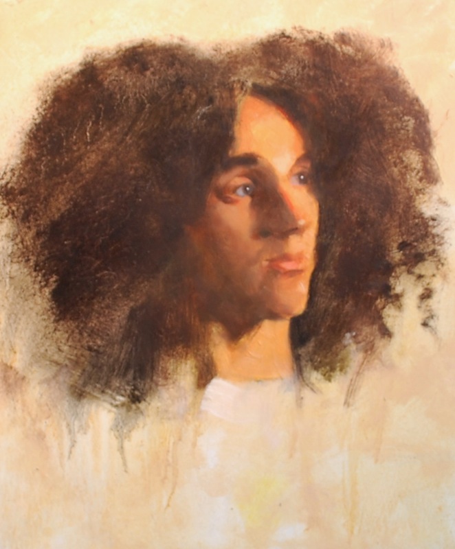
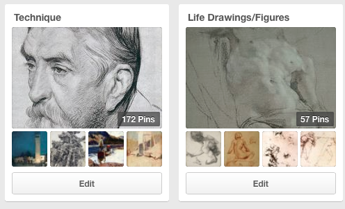
The “Portrait” group is equally filled with great things, featuring artist’s that are both famous as well as those often overlooked today.  And finally,  “Technique” is a broadly based collection of interesting and masterful uses of various mediums.

If you are interested in seeing the boards I’ve assembled,  just follow the link.

Norseth on Pinterest

And if I may encourage you, please feel free to grab whatever you like and start your own boards. Great fun and very valuable.

A Small Portrait Head in Oil from Life

Ala Prima oil

I’ve just had the pleasure of completing this small  (10 x 8″) oil portrait from a model that has been sitting for the portrait class that I lead Tuesday evenings a The Honolulu Museum of Art School.

Noil is a rare find, he has a great look and focus, and maintains a pose with great accuracy.  At one sitting, (perhaps more than one, now that I think of it), he stayed in pose for the entire three hour session without a break.  Our kinda model!

Noil


Anyway, I managed this small piece while teaching, and it’s grown on me over time. There’s a simple and direct “thing” it seems to possess.  “Noil” is painted on masonite primed with Gamblin oil primer.

A Fresh Portrait Drawing in Charcoal

From last evening’s Portrait class…I managed to turn out this fairly quick charcoal drawing of Noil, a very good model we’ve had the pleasure of working with.

Vine charcoal is about the simplest drawing media one could dream up, but really deserves a great deal of respect for it’s amazing qualities.  It has a value range from a whisper to a roar,  yet can be made to disappear with the sweep of a rag.

buscaglia

                      Noil B. Vine charcoal on Canson MeiTeintes,  about 11 x 14″

Gems of Wisdom-Painters On Painting


“The landscape painter is of necessity, an outdoors man….For vitality and convincing quality only come to the man who serves, not in the studio, but out in the open where even the things he fights against strengthen him, because you see, nature is always vital, even in her implicit moods and never denies a vision to the real lover.”

-Walter Elmer Schofield


Nature deals in broken color everywhere, but she never deals in broken values. The color dances but the values stay put.”
-Birge Harrison

You must sacrifice as many details as possible. Keep your masses flat, simple and undisturbed. And it is the impression of the thing you want.”

-William Morris Hunt

Halona Cove Oil Painting-Part Two Painting the Ocean in Hawai’i

Welcome back.

The painting of Halona Cove was at this stage where I left off in the last post.

DSC_0006 Divers,  Halona Cove  16 x 20″, oil on stretched linen

At this stage of the painting the pattern of the shapes (land masses, “whites” of the waves, the shape of the dark shadow, figures, and simple color)  are all in place and ready for further development where appropriate.

This stage is the structure of the painting;  if I have any misgivings about the composition they must be addressed by now. A figure is suggested among the rocks, and  in the water as well.

Step back before moving forward

Before I move forward in this next plein-air session, I pause to refer to my original concept sketch to see if I’m heading where I’d intended.

NOTE: When painting outdoors, and probably even more with the ocean, it’s very easy to get seduced by all of the activity in the subject…and led away from what is important, the strategy of where the viewer’s eye travels in the painting, and what it finds along the way.  I always have to watch this carefully.

halona pencil   Using the original sketch to reaffirm my goal of the work  (essentially, capturing the light of this time of day in this particularly powerful  place in an energizing way) I set up my easel for a third , (or is it now a fourth?) session.

Building and refining the colors and values

The weather has been really kind. That means the light is the same as last session, and  I’m able to get down to work on the various “notes” of color, and developing the dark/light relationships.

I’m also trying to keep the brushwork  fresh  and descriptive, and especially while capturing the colors in the water.  Unlike some other painters, I seem to use a number of brushes at this stage, possibly as many as 12-15.  This way I can keep each note of color distinct and  get the stroke in the shape I want.

My palette for the water  includes Ultramarine, Cerulean, Viridian, and Yellow Ochre, possibly a touch of a Cadmium Yellow. Darks can be helped in the water by a bit of Alizarin Crimson and Viridan, which creates a fascinating transparent grey that is very suitable for this work. At this stage the “whites” are keyed down to a lavender gray of varying warmth and coolness.  There is probably no “straight”, pure white in the painting. I’m also using a Schmincke Manganese Cobalt Blue that I believe is helpful. And there is Ivory Black on my palette, which I find helpful  and useful in the darks.


Halona 3 detailjpg

Painting the figures

The figures are ready to be placed directly into their positions and I do so, referring very loosely to actual figures in the scene before me for color, but still relying on the sketchbook drawings for position and gesture.  They form a generally pyramidal  shape as a group, and I push the gesture and color as far as I can without losing  the simplicity of the brushstroke.

The water and especially the whites of the waves also receive more attention. I’m building up the paint so that these loaded whites physically catch the light falling onto the canvas in a way that contributes to the sense of foaming, breaking , dazzling white water.  These whites are a powerful compositional tool….where they are placed is where the eye will go, and their shapes should work on the canvas as an effective design  pattern.  I find that to be much more important than clutter or details in the water, as I mentioned in the first post.  The whites are also warmed or cooled, sometimes rather subtly,  to create variety.

DSC_0003 - Version 2

So as I develop these concerns,  I’m aware that the painting is reaching a point where any further work will not really help the overall look of the painting, but actually start to work against the vitality that I would like it to possess.

After adjusting some more elements, and defining ever so slightly the island of Molokai off on the horizon,  I then back  away from the painting for a day or two,  then give it a fresh look and decide that it’s ready to be signed. DSC_0003 - Version 3Divers, Halona Cove  oil, 16 x 20″   January 2013

Thanks for your interest in reading the post, I hope it’s interesting and helpful!


Pastel Portrait…a moment revisited

autumn pastel Autumn, pastel on paper , 18 x 24″

I received word that this painting, which has been in my flat files for perhaps six years now, is going to be purchased. Pulling it out and re-viewing it brought back a lot of memories.

A Moment Revisited

The subject, A. T., was in college in NYC as an art major but here in Hawai’i on a visit home.  Now, she’s happily married and with two children, something that certainly wasn’t on her immediate horizon then.  I was doing mostly the ocean pieces that many viewers are used to seeing, and wanted to exercise (or revive) the portrait side of myself.  So I engaged her for a few drawings and paintings during afternoons. I thought it was a good fit. We talked about life a lot while she was posing.  I was a Sunday School teacher at the time, and  my thoughts tended toward the philosophical and spiritual, which is still true I suppose.  Posing is tedious work and she did very well. Things change, people change, and life passes quickly.   I should do more of these. They don’t stop any of the change, certainly, but they contain it somehow and there’s a solid satisfaction in providing that for other people’s lives. Autumn cropped

Halona Cove Oil~ Part One

I’m really enthused over working out of this lovely cove again, and the watercolor (see previous post) was an ideal way to break back into it.

I like to paint with a goal for the work, and by that I mean a motivation or reason for pursuing it artistically.  This subject has distinctive elements and challenges that make it quite unique… it’s beautiful and it’s a bit dangerous here… and it doesn’t “pose” for me, it’s all in constant motion.  Very challenging to work directly from.

Opposites Attract

Consider lights and darks; in one glance you have the brightest of whites  in the light and the darkest of shadows,  for color there are warm earth tones opposed by our shattering blue-greens. Lines are jagged or curvaceous, or even perfectly straight. The masses are dense, bulky and immobile in the rocks, or fluid and streaming in the water.  Everything is in opposition, and  it’s all interconnected within itself.

So with all of this packed into one small area, it warrants my best effort.

My first composition, from the prior watercolor, has led me to focus more on the distant figures and the contrast they present against the rocks as that incredibly dark, end-of-day shadow quickly draws itself across the cove.

But before any of that, I have to design and place the big shapes.

Here’s the first afternoons progress:

Halona Cove, first lay-in 16 x 20"

I worked until the light failed, after 4:00, and then made some mental notes of the figures that I observed around the rocks.

Back to work

I was fortunate to have several consecutive days that offered essentially similar light, so returned at the right time to continue on the painting.  This is a matter of seeing that large shapes are where I want them, and making certain that the color, which is perhaps one of the things I try to be most genuine about, is true to nature. The motion of the waves has to be thought through…the powerful white of the waves draw the eye by contrast, and I want them to create a rhythm that moves across the painting successfully.

Halona Cove ll

At this point I’ve begun to indicate a key figure, but haven’t yet made up my mind about the pose or position in the painting. Colors have developed another step, and the rhythm of the waves is being worked out.  I find that this stage is much more important than noodling the painting of the waves in a more precise manner…that sort of work won’t help a bad pattern.

This was a good afternoon’s work.

Working out the figures

I spent some time and sketched out some possibilities from memory.  Since they are tiny, I’m not concerned too much with the figures beyond their possessing an accurate sense of the light,  good proportions and gesture.

DSC_0001

Halona Cove  oil in progress, 16 x 20"
Halona Cove oil in progress, 16 x 20″

I’ll continue this post when I have more time!  Thanks for reading.