Right Under My Nose

We live in a wonderful urban neighborhood in Honolulu called Kaimuki.  Seated on the backside of Diamond Head, it’s an enjoyable mixture of both modern and century-old homes, a funky/trendy business area, and a populace that includes most all of our island’s varied ethnic heritages.

It’s also great for walking…rolling hills, old concrete sidewalks (with the occasional child’s handprint), and fresh trade winds that provide delightful comfort during an evening stroll.  One notable feature is a high, rocky point topped by a small park. Called “Christmas Tree Park” by locals, it’s just a few blocks from home, and during early evening it’s quite popular. There’s a group of dog-lovers who habitually gather, perhaps some first-daters trying things out, and a variety of others who enjoy the westward view over Honolulu at sunset.

While I’m not a regular, I do occasionally drift up that way after supper. And it was on such an evening that I finally decided to get started on the early-evening painting I’d been contemplating.

The Influence

For years prior,  I’d been admiring a painting by the 19th century  Spanish painter Ramon Casas.  His was also a “townscape”, of Montmartre, painted as it appeared back in the Impressionist days.  I’ve always been excited by Casas’s picture; an interesting puzzle-pattern of darks and lights, rooftops, roads, and trees. It was definitely an inspiration for where I hoped my own picture could go. 

As for my effort, I envisioned a days-end feeling: the fading daylight, with rose colored cloudbanks overhanging the rooftops and random jumble of our neighborhood. And all to be painted in thoughtful, descriptive brushstrokes.
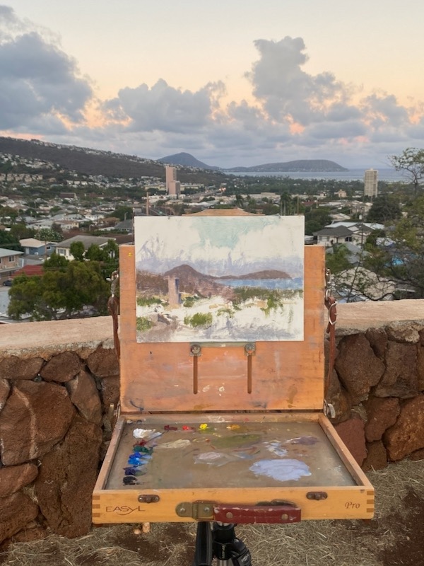
The initial setup and progress in the lay-in.

A Strategy

I decided it would be best to arrive at the spot around 5:45 each evening.  This would allow a window of workable light of perhaps 45 minutes.  I supposed I’d need perhaps 8 or more sessions, but it was hard to tell.

Practicalities

I keep “prepared” wooden painting panels in my studio, and decided 9 x 12″ was the right size. I also chose to use a tripod mounted pochade box. This would keep things compact… important because my own shadow was needed to block the sunlight behind me from falling on the painting, which would distort the light/shadow effect. Gusts of strong wind made using an umbrella to shield the painting from the setting sun too risky.

The Start
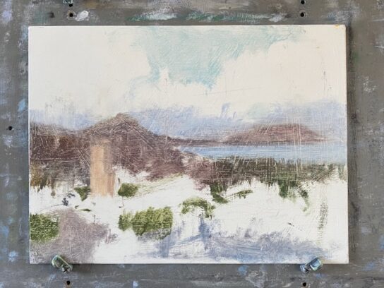
The first round of work involved getting the “main pieces” in the right spots on my panel.
I never rush this step because the personality of the whole painting begins in how the painting’s space is”divided”.  
I thought of the “main pieces” as the areas of land, sea, clouds and sky. . . 4 large, interlocking puzzle pieces. Which of those areas were to “dominate” is what determined the cropping. 
 
The large tower’s placement in the lower left quadrant was important. It’s a strong “point of attraction”…but needed to be placed with care.  The distant peninsula needed that slight “opening” on its far right edge. It connects sky and ocean as a single shape.
 
After the first sessions work. The paint was scraped down with a palette knife to “lose” hard edges and unify the work overall.

Next Steps

Weather permitting, I continued to return each evening for more work on the painting. Progress was gradual, but steady, always keeping the original intentions I described in mind.

In time I found that I was able to anticipate what the light and color were likely to do, which was a big help. This is just a sidebar here, but becoming familiar with the “personality” of a given location is a really wonderful secondary aspect of the “plein-air “painting process.  One’s painting locations can also, in time, become places of deep reflection and attachment.  
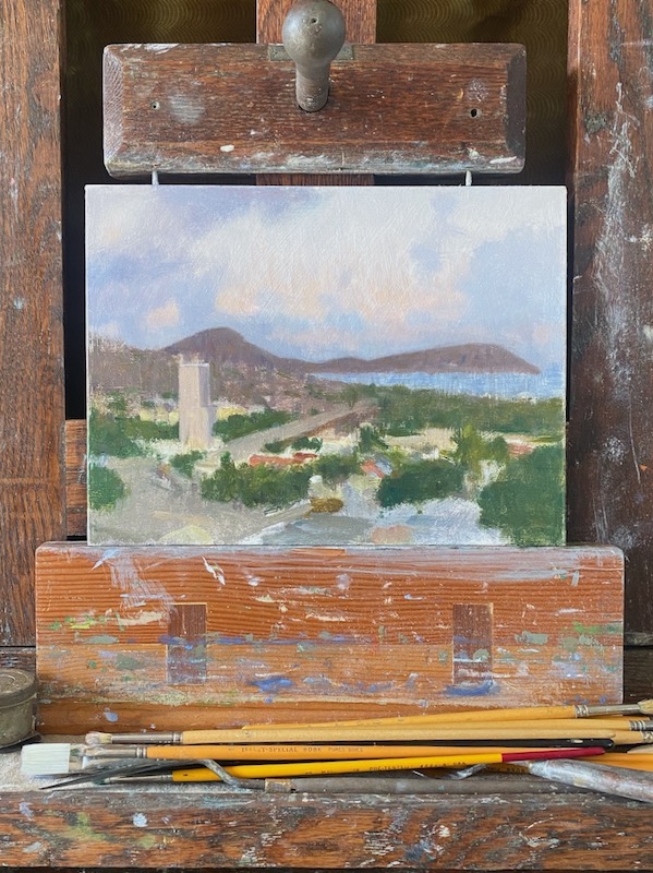
The painting on my studio easel, a few more sessions in, undergoing some morning-after adjustments. 

As the work progressed further, I also committed to trying to maintain some ideals…

  • To attempt to paint the “ensemble effect” …the overall appearance of the entire scene as it might appear in one glance.
  • Seeing everything as “simply a piece of paint”  of a particular shape, value, and color.
  • To pursue “suggestion” over “explanation”.  


Completion Of The Work
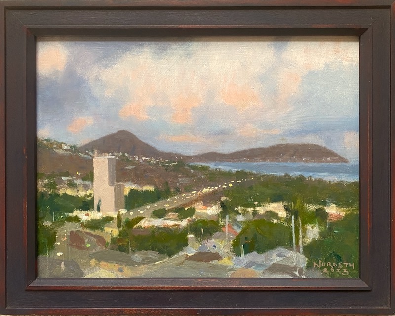
The completed painting

 Further sessions were simply about adjusting and refining, always with an eye towards the look of the entire painting, not fussing over specific and irrelevant details.

There was a nice general interest from the public. Most were unfamiliar with the kind of work I was doing.  It was pleasant to offer some explanations to the curious. That was a nice sidebar to the whole project.  

Because the painting is in traditional oils, the actual drying time is a minimum of six months. At that date, the owner of the painting will return it briefly for a final varnish. This will the crowning moment. . .the painting will then be restored to its original richness of color and permanently protected.

Where does your eye go?

So…where does your eye go?

That’s a question I’ve loved asking people as we view artwork together.

I love it because it begins to open us up to the idea that there may be a deeper experience awaiting when looking at a painting. That without any awareness on our part, a piece we’re viewing may be subtly guiding our eye intentionally.

An interesting side of composition involves the deliberate leading of the viewer’s eye. It’s not something I was every really “taught”, but since realizing that it exists, it’s added a lot to my enjoyment of good paintings and drawings. 

 I think it’ll do the same for you. But the first step is to study what attracts our attention and what gets it to move in a picture.

A Power of Attraction

Our eye is always searching…in a sense, it’s hungry.  We can notice how it works when leafing through the pages of a book, searches a room for misplaced keys, or recognizes a familiar person in a crowded public space. Our attention is drawn and engaged before we know it. For our purposes now,  we’ll simply call a this a “power of attraction”.

For paintings a “power of attraction” is anything within a picture’s composition that can attract your eye. We already know that a bright color in a drab setting or a human figure in a landscape can become a center of attention…what a lot of people call a “focal point”.But let’s consider what else an artist might use to move your attention in a more subtle way. Just for starters it could be any of the following…

-an open window or doorway in a background

-a contrast of light or dark, such as a highlight on a dark shape

-a color, by it’s strength or by contrast

-a contrast of objects…something that differs from others within it’s setting

-a figure or animal

-a sharp edge surrounded by softer edges

-any point/mark that has “power” due to it’s placement, especially nearer to an edge of the painting

Whatever it might be, it will possess a visual magnetism that makes itself known to you subconsciously. And importantly, not all objects have equal power of attraction.

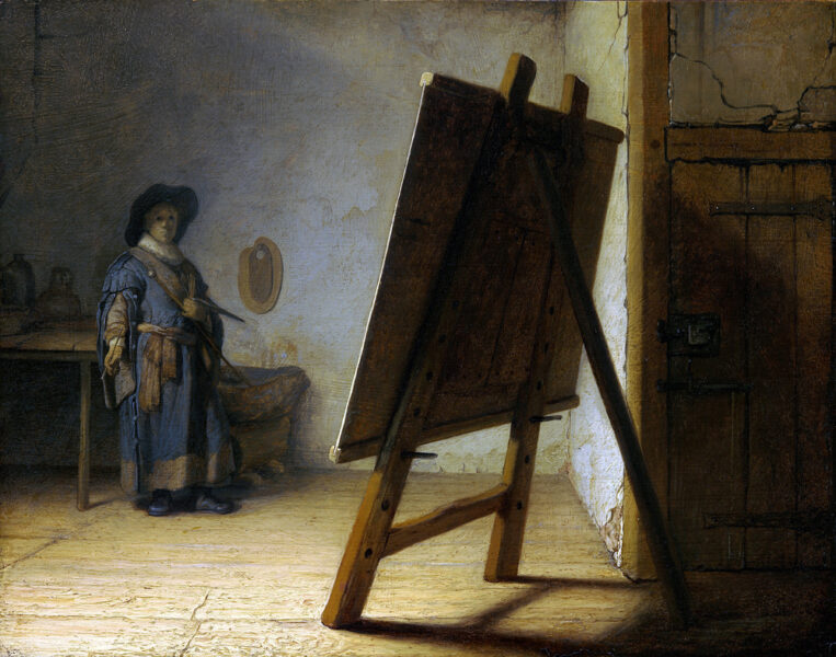
As I gradually became used to this, it became very interesting to look at a picture merely only to see how the artist would draw my attention from one point to another. One specific moment  I learned a strange truth…that the central and dominant THING in a painting was not the main subject but an essentially abstract shape placed in the full light, with the artist in the self-portrait playing a slightly secondary role.  I found that reasoning to be fascinating.

And the artist?

Rembrandt Van Rijn

Why Study Rembrandt?

Though there are countless examples in traditional art we can study, I found that Rembrandt, and especially his drawings, are the ideal place to begin seeing this business in action.  Often his seemingly modest & commonplace themes become excellent lessons in leading the eye.

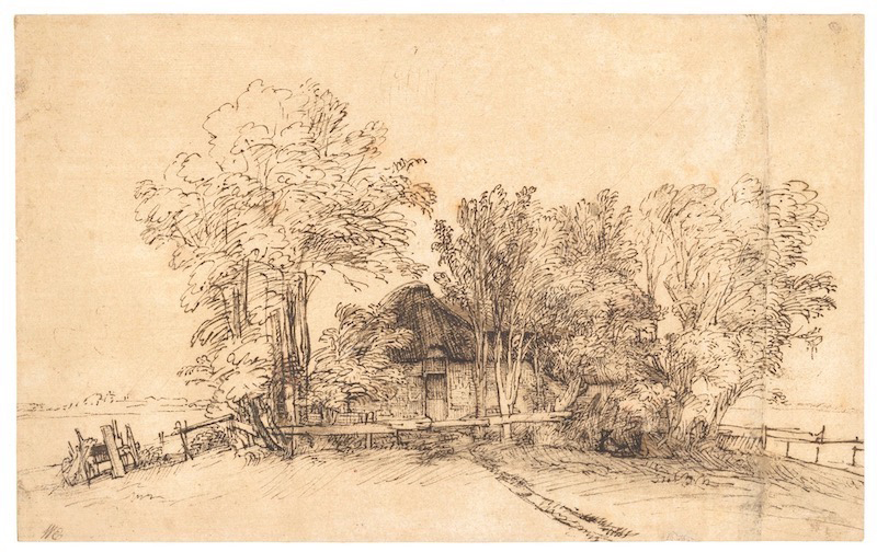
As an introduction to the concept for us to try together, this pen drawing is a fine example. I recommend that you enjoy a few moments with it before proceeding. Just pause and ask yourself where your eye wants to go as you examine it.

Rembrandt’s pen and ink drawings have a variety of “attraction” points that reveal themselves with a bit of looking.  The drawings were often created on ramblings in his town and surrounding countryside. This was not an extraordinary sight in Rembrandt’s day, perhaps the same as an everyday home would appear in our own neighborhood. These drawings represent his everyday experience, just as we also have our own familiar features of our time.  He was an eager observer, and exercised his gifts of observation and interpretation continually.

In this example, you may have noticed that your eye moved from part to part, resting here and there, and connecting one spot in the drawing to another.

A focal point isn’t enough

Having a point of interest that dominates the picture (a focal point) isn’t really the same as creating a series of connections that can lead a viewer through a picture. The reason is because a single focal point’s value is mostly only interesting as an object. The alternative we see with the Rembrandt drawing, a designed picture suggesting a discernible pathway, is a series of small discoveries that gives our mind an incentive to engage. Ideally, one is led to travel through the picture rather than looking at the picture.

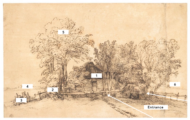
Below is a breakdown of what I get from my own study of this beautiful drawing. I’ve found that the various things that attract my eye have differing strengths, but that with one thought a pattern can arise. But that’s just my interpretation. Where does YOUR eye lead you?

While I admit my diagram is subjective, I hope you agree that this is a dimension of picture enjoyment that, for an artist, is a valuable way to unify a composition.  Rembrandt’s drawn works (for me) are a particularly enjoyable source for seeing this in action.  If you’d like to dig deeper, I suggest looking at the library for books on Rembrandt’s drawings, or finding the old Dover publications of “Drawings of Rembrandt” (volume II is my favorite) as a starter.

If you want to really get a handle on composition, it’s a fascinating dimension.

My Favorite Way to Study Composition


We know that with practice, most artists will get a handle on “how” to paint the parts of a picture. But the composing of pictures is a different task…one that requires experimentation, sensibility, and the development of taste. And the question is…where do we find those tools? 

It’s good question.  Here’s where that question has led me.

There’s a Power of Pattern

In my own long search to learn how to compose (meaning “organize a painting well”), I saw that I’m drawn to certain pictures by some vague attraction that I can’t account for. An example was that while flipping through the images in art books, something was making me stop and go back to something that flashed by my eyes in a moment, even though I’d only had the briefest of glances. Over time I was able to figure out that  an overall pattern of a painting was the subconscious power at work. 

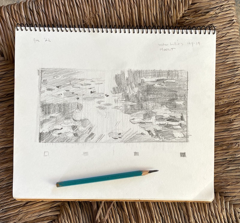
Realizing this, I was able to eventually work out a simple method of analyzing the paintings I most loved, and then adapting what I’d found into my own pictures. The method is useful in studying the work of others, or designing one’s own compositions. I simply call it the 4 value study.

The 4 Value Study

This process takes the artist through the placement of the largest shapes first. This is the division of the canvas, so to speak, and these are the big initial decisions that eventually affect everything to follow. If you’re doing a study from a painting in a book or one in a museum, you will gain insights into how that artist has chosen. If you’re out in the field on a landscape o working with an interior subject, you’ll be planning in advance how the pattern might work, and preparing for less struggle in the long run.  It’s often been observed that the regrettable decisions that are evident in a finished painting are choices made in the very first stages. This reduces that danger. 

Also among the benefits are

  •  it can be done in a short amount of time, (in this example, about 25 minutes) with simple materials, and in your personal sketchbook. This enables you to easily review.  
  • The exercise has you retrace the original artist’s steps, because you start with the “big pieces” that make up the underlying structure. This puts you “looking over their shoulder” in the decision process, because they probably put their energy into the interrelationship of the main pieces. 
  • With only 4 values to work with, you must ignore details and and instead see the painting in terms of a pattern…that is an intentional arrangement of big values and big shapes.  That’s part of what’s catching your eye to stop and look in the first place. 

 Where do I start? 

Begin with a good painting from a good source.  

Find a painting that you admire… a painting that you wish you had made. I sometimes look online, on sites such as Pinterest, and have particular artists I find especially beneficial. Their small studies are often in the same mix with their completed works and are great helps.  Also, books and catalogs from museums, available free at the library, are a good place to poke around for images that impress you. But best of all is before an actual painting in a museum, which is a wonderful way to the most out of a visit.  And nobody will mind your sketching in a small sketchbook. Other people will be interested/inspired to see you working.

If you choose a photograph, choose a photo in color rather than black and white.  The advantage of color is that you’ll learn to read the value of color, which takes some practice, rather than having it done for you by a black and white reproduction.

The only tools I use are a soft graphite pencil (6B is good), and an eraser at the end for cleaning things up.  And as I’ve mentioned, I like to mingle the 4 value studies in my regular sketchbook that I do my other work in.

Procedure

For the demonstration, I’m using my sketchbook and an image from a book. The painting is by a favorite Russian impressionist, Isaac Levitan. I picked it for its full value range (meaning from white to almost black and simple grays) plus interesting big shapes. He’s a favorite artist of mine, so why not get inside his head?  What easier way to learn about his work? 

                                    The first sep in a four value drawing 

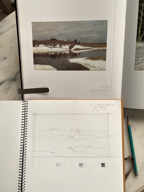
                                      The art and the sketchbook positioned for easiest comparison. 

In the image above, my sketchbook and soft graphite pencil are at hand, and the painting I’m working from is immediately in front of me at a comfortable angle. This is so my eye travels the shortest possible distance to compare the image and the drawing.

Part 1. How to start

A.  Find the proportion of the rectangle that I’m copying. It needs to be the same proportion (size) as the rectangle in the reproduction. If you need to use a ruler, feel free. Notice the faint “crosshair” lines to show the center of the rectangle…and it’s okay of they are loose and sketchy at the start. This division of the rectangle will help p you tell where the shapes in the painting are. 

B.  Make a scale of 4 steps below the rectangle.  Start by drawing a small white box, two more empty boxes, and then a very dark box, like I’ve done at the base of the drawing above. This is the outside range of our pencil’s ability to create light and dark.  Between the black white box and the black box, create a light grey and a darker grey. Try to keep the steps between all four values even. 

Important-everything within your drawing is going to be in one of these four values, even though you’ll see many more values in the painting. Your challenge here is to simplify the many values of the painting into four. 

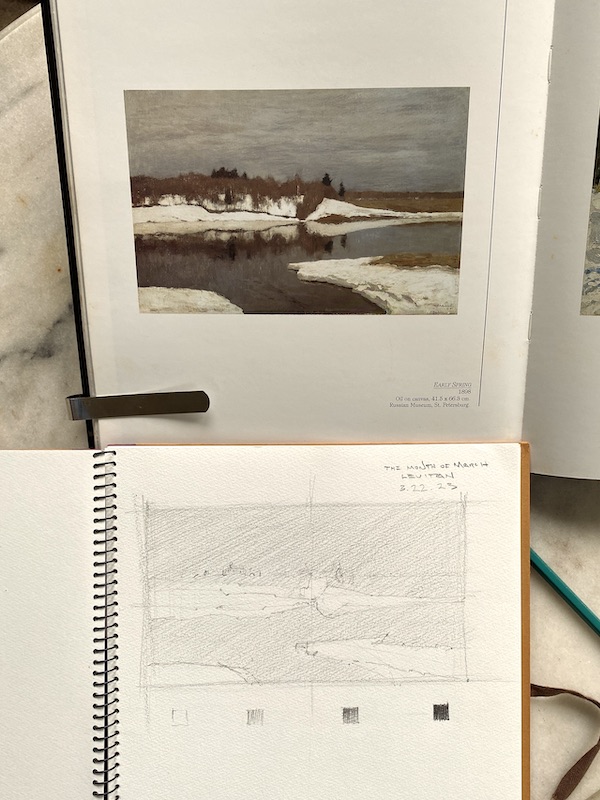
C.  Start with a large shape first.  The dark water forms a big shape, and the sky another, so I’d start with one of those. Try to place them as accurately as you can, and with a very light, sketchy touch. If you can do so very lightly, it’s a good advantage. Study the original and compare the big shapes to what you’re making, and adjust if you see something that looks off. 

Once that’s established (again, with a light touch so you don’t have to scrub out dark lines when adjusting later), continue to outline the shapes of the painting. Sky shape, trees shape, snow shape, etc.  

Some advice that will be very helpful..work from the largest first, lightly, then work your way down to smaller shapes. Disregard as many details as you can, they’re just clutter at this point.  Add them after the big shapes and values are right. 

Part 2. Getting the Light & Dark

Now it’s time to render the values.

To begin this step, take the lightest of our two grays and cover the entire paper with it…except what is to be white. This is what I’ve done in the image below. You can see what I did in the photo, and using light 45° strokes is the easiest and most natural way to lay down a gray.  We’re “reserving the white”, much as a watercolor painter does… but everything else will at least be the second grey. So you can cover everything but the lightest shape with it.      

Our lightest gray applied.


Third Step

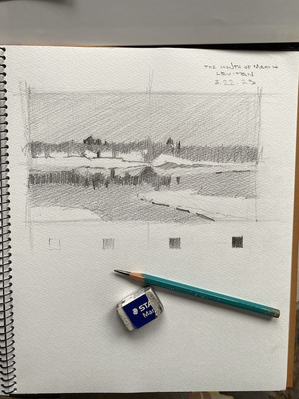
The addition of the first grey sets us up for the next, our darkest grey, which is 75% darker gray from the white to black.  Since we’ve already applied our light grey over everything that’s not in the white value makes this step easier. Anything that’s not in the darkest dark or the lightest grey will be made of this, regardless of what type of object it happens to be. And remember, it’s only shapes we’re interested in, not any details. 

One thing you’ll probably realize is that all of this requires you to make decisions about how to group things simply.  Four values aren’t nearly enough to account for everything we see in a painting, but that’s the good part…we now have to forget about what things “are” in the painting and work as a designer…grouping values together regardless of what they represent (sky, water, hills, etc.) in the picture.  

The reason you want this skill is because it will lead to freshness and clarity in your own work.  And you can develop the skill in your sketchbook…it’ll change how you view painting for the better. 

Final Step


To finish, it’s simply a matter of adding the pattern of the darkest darks to the other three. This is where it’s advantageous to have used a soft pencil; it makes that darker value easier to apply richly.

After doing so, I finally clean up the whites a bit with my eraser, re-adjust the values a bit overall, and enjoy the drawing and painting. A light application of a spray fixative will preserve it for years to come. 

Conclusion

One of the main task of the painter is to arrange and organize what you paint. Determine what’s important, and discard everything that isn’t. With this method and some practice, you can learn the thinking artist’s you admire put into their own paintings, which is information that you won’t get by just looking and admiring. 

And finally, the greatest benefit comes when you are in the field working out a painting, or in a studio with a painting, this skill will certainly help you quickly determine your best design. 

I hope you’ll give this a try…and would love to hear about your experience or any questions. Feel free to comment, and GOOD LUCK!

Lorem ipsum dolor sit amet, consectetur adipiscing elit. Ut elit tellus, luctus nec ullamcorper mattis, pulvinar dapibus leo.