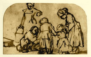
As I begin this small series investigating the drawings of Rembrandt, it would be helpful for me to mention where this great interest of mine comes from and why.
In my own search to become a better draftsman, I’ve looked at everything I could find to try and learn what distinguishes the good from the great. Of all the many known good draftsmen in Western art, I personally find Rembrandt to have the best documented and largest body of work that is capable of speaking to us today.
Many of Rembrandt’s subjects are right in our own living rooms, or outside of our own front doors. His drawing practice overflowed with all of the good lessons of picture making; we simply have to look past the funny clothes and the rugged handling. Rembrandt’s is not the beauty of Raphael and the Italians, his is a streetwise, subway-platform to Starbucks mirror of our existence.
I’m so enthused because I’ve learned so much from looking at these drawings and asking the right questions. Compositional lessons abound. Rembrandt is entirely capable of leading your eye without your even knowing it.
A confession…I don’t find most of Rembrandt’s drawings very beautiful at first sight, like I might with Raphael or Michaelangelo, or Ingres or Degas. I find them fascinating; it’s sort of like comparing the appearance of Pierce Brosnan to Daniel Craig as James Bond. One’s pretty, but the other’s got character and looks a bit crazy.
Okay, that’s the pitch. Let’s see what we can find in this drawing.
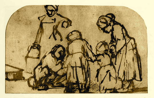
First thing we all notice is probably that it’s badly cropped by another hand…I don’t know why, but it happens. A lot. Monks cut a doorway into the bottom of Leonardo’s Last Supper, because sometimes you don’t know what you have.

The drawing can be divided and viewed in two parts, foreground and background planes, and the thing to examine first is the foreground group.
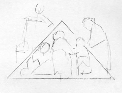
Rembrandt groups things carefully, and below is what a diagram reveals (another use for your sketchbook, students).

There’s a clear triangular arrangement, (art experts love to add “the most stable of the basic shapes”) I suspect you might even be able to say conical if the cropped off feet made up an eliptical arrangement, which I bet they once did.
All four of these figures connect physically…I mean that they touch, and your eye, beginning on the left with dad, goes up, down, and through, very rhythmically, to the actual reason for the grouping…the toddler being helped. The central-most figure in the whole piece is the one we see the backside of, which is a Rembrandt kind of touch. I think that’s Grandma on the right. Mom has the bucket, and I hope it isn’t dinner in there.

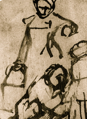
Speaking of Mom, previously all of my attention in this drawing had been focused on this fantastic woman with the bucket in the background. For so few lines, most all straight and thick, she possess the perfect feel and character of someone carrying a heavy load. The straight arm carrying the bucket, upraised arm counterbalancing, the slightest rightward tilt of the figure…we can feel the strain in her arm. Head looking down slightly…just what you do when you’ve got a heavy burden in one hand.
Did you notice that none of her ink lines touch those of the other grouping? The effect is to create an atmosphere between the two planes.

A couple of other things: Rembrandt manages to show us the human figure from the front, profile, backside, three quarters (the toddler), and another profile. That’s clever. And the drawing, from side to side, balances perfectly. I also admire the sense of near-balance in the toddler, just slightly tipping forward in the masses of head, thorax, and pelvis. She may stumble forward if not supported. Those are the three masses that create rhythm and balance in the figure, arms and legs just follow where they are told.
And finally, here’s a good question. Do you think all these folks were posing?


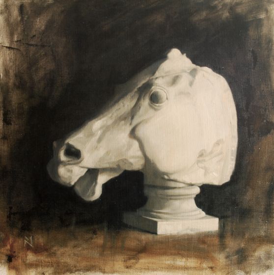 Parthenon cast, oil 22 x 24″
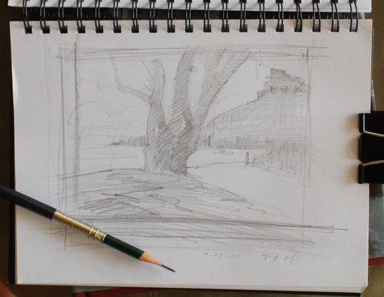
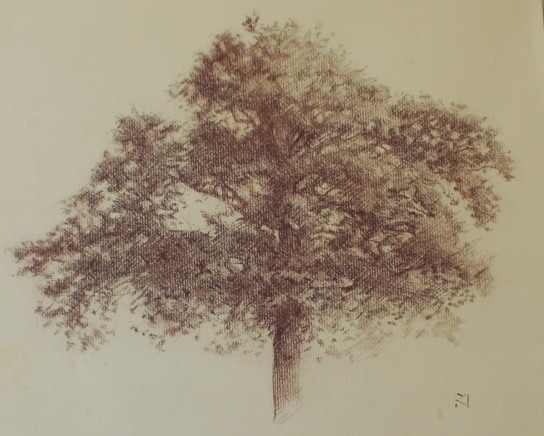 Tree Study Conte Crayon on paper

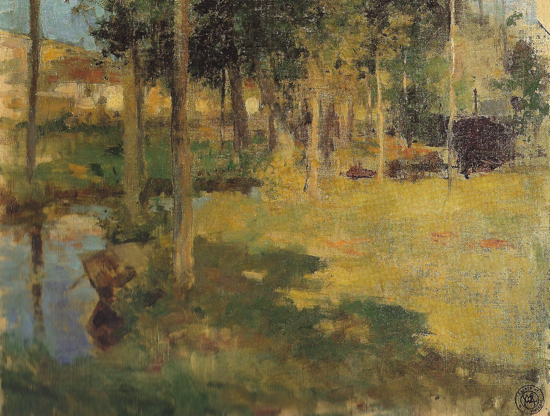
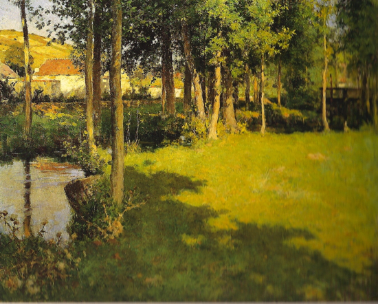 Giverny , oil on canvas, 26 x 32″