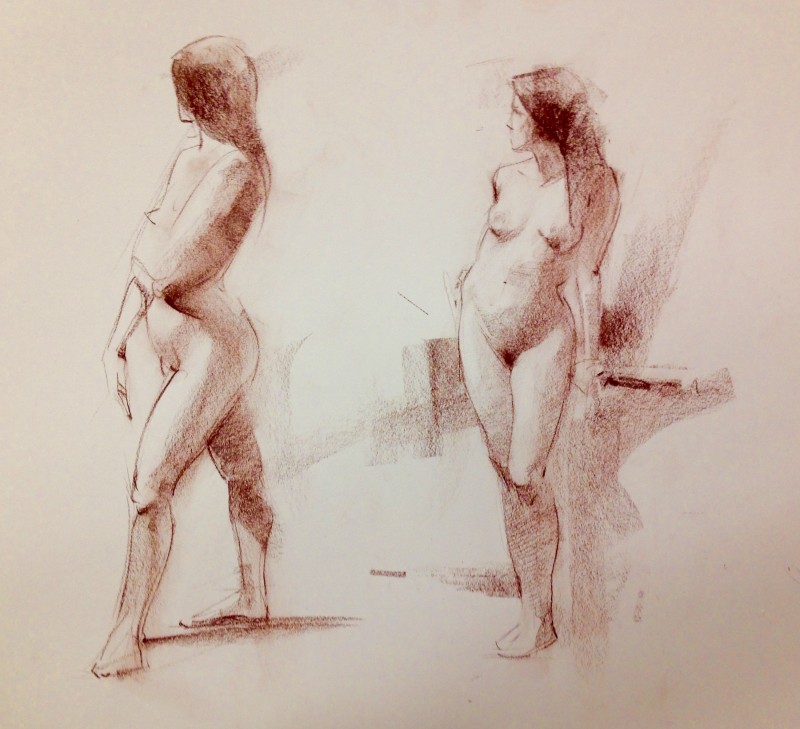
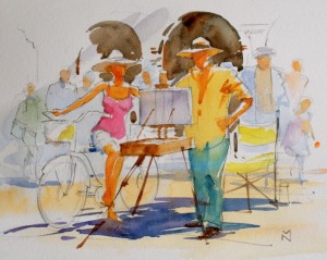
Re-discovering the Cont’e crayon, an often overlooked artist’s tool, with encouraging results.
Continue readingA Special Workshop-The Figure in Watercolor October 6-7
I have a peculiar relationship with self promotion. While I want very much for people to see my work (that’s half of the equation), I possess a reluctance to market myself conspicuously. I don’t much like discussing the sales of my paintings outside family and closest friends, or operating as if I’m luring the unwitting into the artist’s version of a car dealership. I like to keep the work and the selling somewhat compartmentalized. This blog is an example, I don’t get into selling here, I would like readers to just come aboard and visit without a subtext.
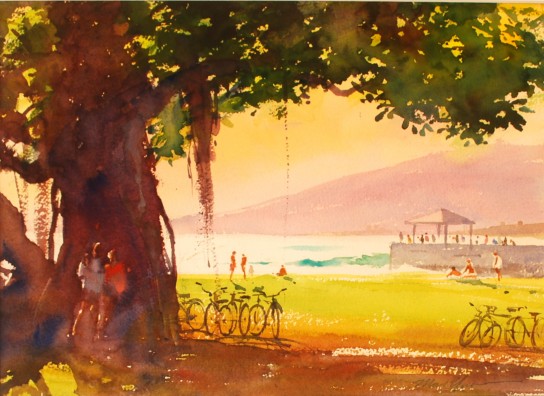
That said, I now would like to brief my reading public on something that I’ve been working on that has me excited a bit beyond all reason, a special watercolor workshop on painting the figure.
As you may know, watercolor was my first love-experience in painting, and while I don’t participate in it full time, I am perfectly comfortable working in it, and I often return to it for the working out of those subjects where watercolor is appropriate. Also, I confess here rather remorsefully that I have a contrarian streak at times, one that chafes at some of the goings-on in the watercolor world. There are great things being done by very talented people, certainly. But I also see very sincere painters-in-the-making that are struggling with some very basic and essential things about making paintings. They seem to go in circles, relying on method rather than really seeing, and hoping that tips n’ tricks might carry their work. As a result they often stumble on the subject of the figure, and so that is the focus of the workshop I’m conducting in October.
Here’s what I’m doing:
My first step has been to analyze and address the repeated problems that I noticed watercolor painters incur. They are summed up in the workshop credo I developed:
We are always looking ~We are always designing~ We are seeking fluency~We are wiling to practice.
There was a fifth We are artists first, watercolorists second, but I dropped it, it’s a bit much though it speaks to the problem of separating “watercolor” from painting in general, an error I believe.
Next, I created a power point presentation to address and demonstrate each of these necessary attitudes. I spent way too much time on making this, but found myself really excited to show what I think is a valuable point of view on the matter.
First, there’s a whole section on the study of master drawings. People need to see the great work of the past, and why it’s great. Rembrandt’s wash drawings are a great lead-in to the importance of seeing your everyday world, taking clues from your immediate surroundings and doing something with them. Then, committing oneself to a lifestyle of continued eye-opening, sketching, and active participation in development of one’s work as a designer, taking what’s around you and shaping it. I also have a section on my own favorite painters in watercolor, many of whom students are unfamiliar with, because I believe that to gain fluency, you need heros and mentors. Zorn,Sargent, Seago, Bonnington, and others have influenced me greatly, and I’m very happy to introduce some favorite works by them.
The workshop itself will be fun, I’ve developed a series of exercises to deal with everything from the slight indications of the figure in the landscape, sketching habitually, memory work, and finally to working directly from the live model.
Below is one piece I developed to market the workshop, I’ve posted it in the past. It’s developed totally from imagination and recollection of all sorts of things, which is something I’ve taught myself to do. I want students to understand that this is possible, it’s an attempt at fluency and integrating their life experience and their craft. It’s simply the sort of liberating and challenging work that I think artists, generally speaking, should some how be up to attempting. Without photos… those will always be around anyway.
For more information, email me at mark@marknorseth.com or call the Academy at 808.532.8741. I believe we have only 3 spaces left. Could be a game changer.
The Figure Drawings of Alfred Stevens
I came across this excellent link to the drawings of Alfred Stevens, the British sculptor (not the Belgian painter of the same name and era). The drawings are beautiful, and the enlargement feature is particularly helpful.
You can see for yourself here.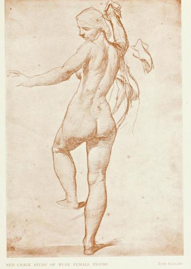
Something in sanguine
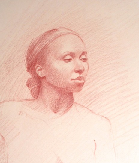 Sanguine seems to be very sympathetic to the rendering of human form, and so many of my favorite figure drawings are executed in it that I enjoy putting it to use from time to time.
Kohinoor manufactures the sanguine crayon I used on this, which I place in a brass holder and sharpen with a beautician’s callous remover. It’s got a slightly waxy binder, barely noticeable, and works fine for what I want to do.
My first step is to lay down a light tone with broad and easy strokes, which I rub loosely into the paper (a warm straw-colored Canson Mi-Teintes, the non-golfball-textured side) with either a bit of soft, unprimed linen canvas or paper towel, and then develop the drawing working from the outside-in, getting the big outer shape of the head established as best as possible, and gradually bringing the entire drawing along from there.
The longer I can resist adding the features of the face, just working with the underlying forms ( kind of like the look of a nylon stocking over a bandit’s head!) the better. My own taste is for the drawing to emerge somewhat loosely and casually from the paper, not suffered over to the point of being hard on the eyes of the beholder, if possible. I’ve seen drawings that have that sense of growing out of the page effortlessly, somewhat rarely I admit, and I’d like to get that sensibility into my drawings. I’ve used the term “casual elegance” to try and describe it, but that’s not sufficient.
If I ever get it, I won’t need to explain it. We’ll both know I think.
In the darks, moistening the tip of the crayon slightly gives a richer note. Removing highlights with a kneaded eraser is the last step. This pose was a little more than an hour, and is carried about as far as I wish to go with it as far as rendering. I always want to get a better expression though. Any fatigue of the model should never show.
